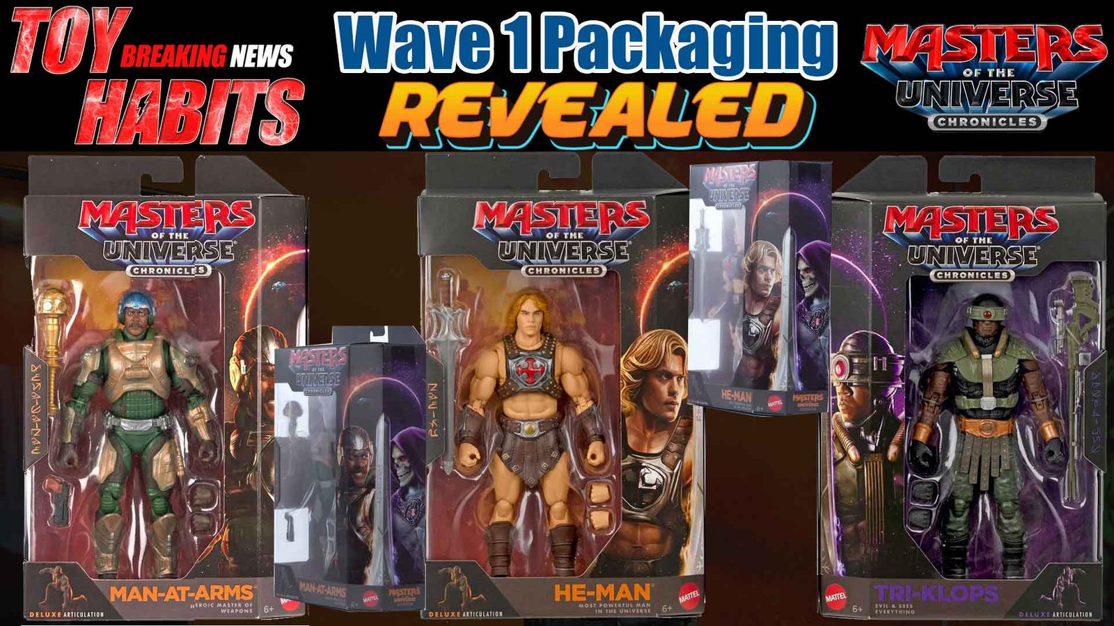
MOTU Chronicles Wave 1 Movie Figure Official Box Reveal
Seeing this hit my feed honestly stopped me in my tracks, because when Roy Juarez shares something like this, you know it’s coming straight from the heart of the Masters of the Universe creative process, and his latest post pulls back the curtain on what the MOTU packaging design team has been pouring their energy into with the new Chronicles line. As someone who obsesses over MOTU packaging just as much as the figures themselves, it’s incredibly exciting to see this “Good vs Evil” concept articulated so clearly, with the idea of duality literally built into the packaging so it can live together as a unified display or stand on its own depending on how you choose to present it on the shelf. We’ve already seen booth images of the boxes and figures in person, and those early looks made it clear just how thoughtful and intentional this design approach really is, but hearing the team explain the philosophy behind it makes it hit even harder. It’s honestly amazing to watch the MOTU packaging design team get the spotlight here, especially knowing how much work goes into making these boxes feel like an extension of the world of Eternia rather than just a container. The fact that this Chronicles packaging brings together packaging design and art direction by Roy Juarez, toy design by Lavakaiju, packaging engineering by L. Pukhrambam, and copywriting by Melissa Karlin and Rob only reinforces how collaborative this effort is. This is the kind of behind-the-scenes insight I love sharing, because it reminds us that Masters of the Universe is still being crafted by passionate creatives who truly understand what makes this brand timeless.

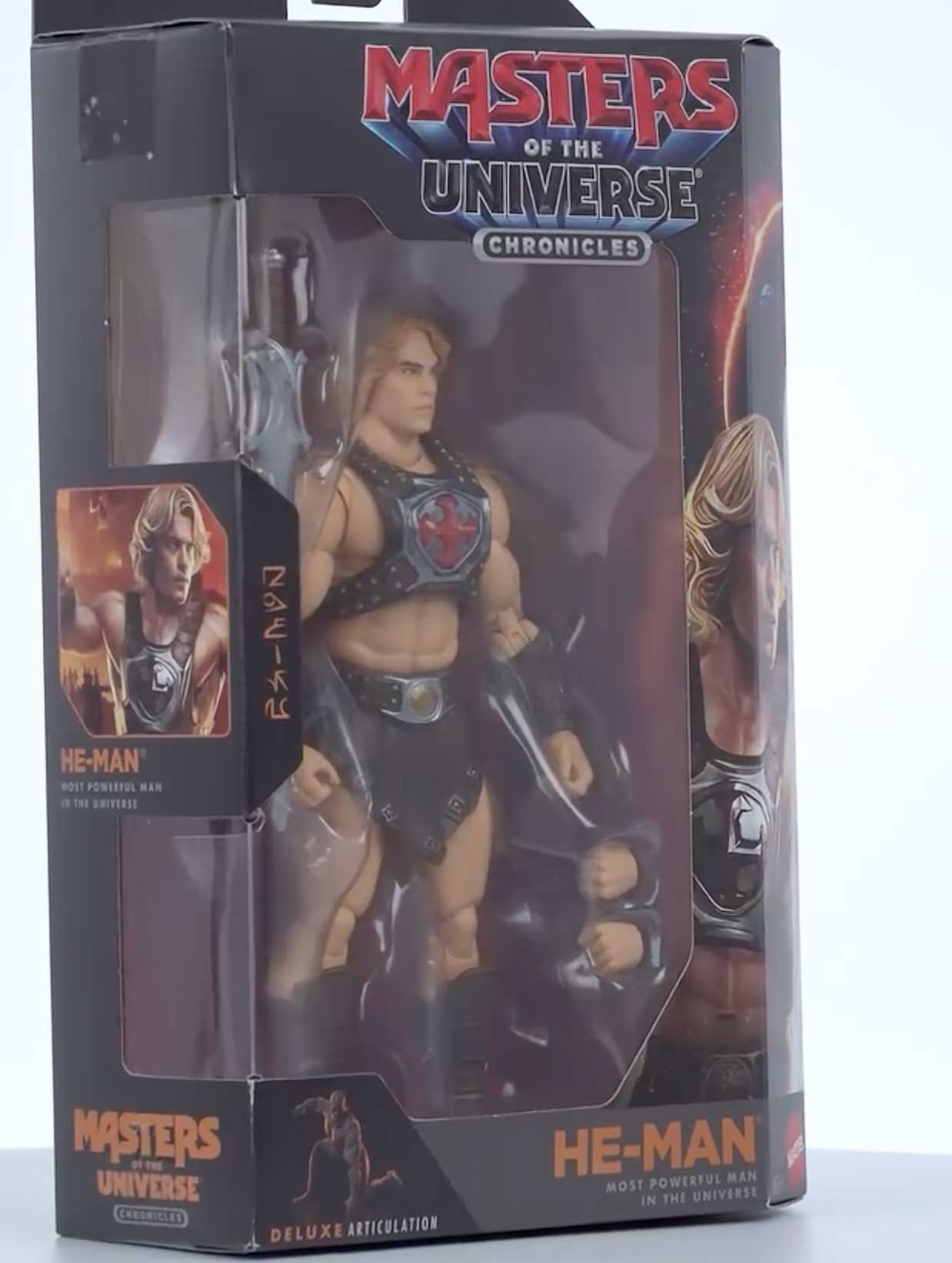
The new Masters of the Universe Chronicles logo is front and center, combining the classic red and blue Masters wordmark with a darker, more grounded presentation that sits over a sword backdrop. I like how the added Chronicles banner clearly signals a fresh chapter, and it feels intentional as it rolls out across the packaging for the new movie figures. This logo sets the tone for the entire line, tying the box design together visually while separating these releases from the existing Origins and Masterverse looks.
He-Man
The box shows He Man inside a clear window with the figure wearing silver chest armor with a red emblem, brown harness straps, brown shorts, and boots. The Power Sword is packed along the left side, with alternate hands visible on the right, and the Masters of the Universe Chronicles branding displayed across the top.

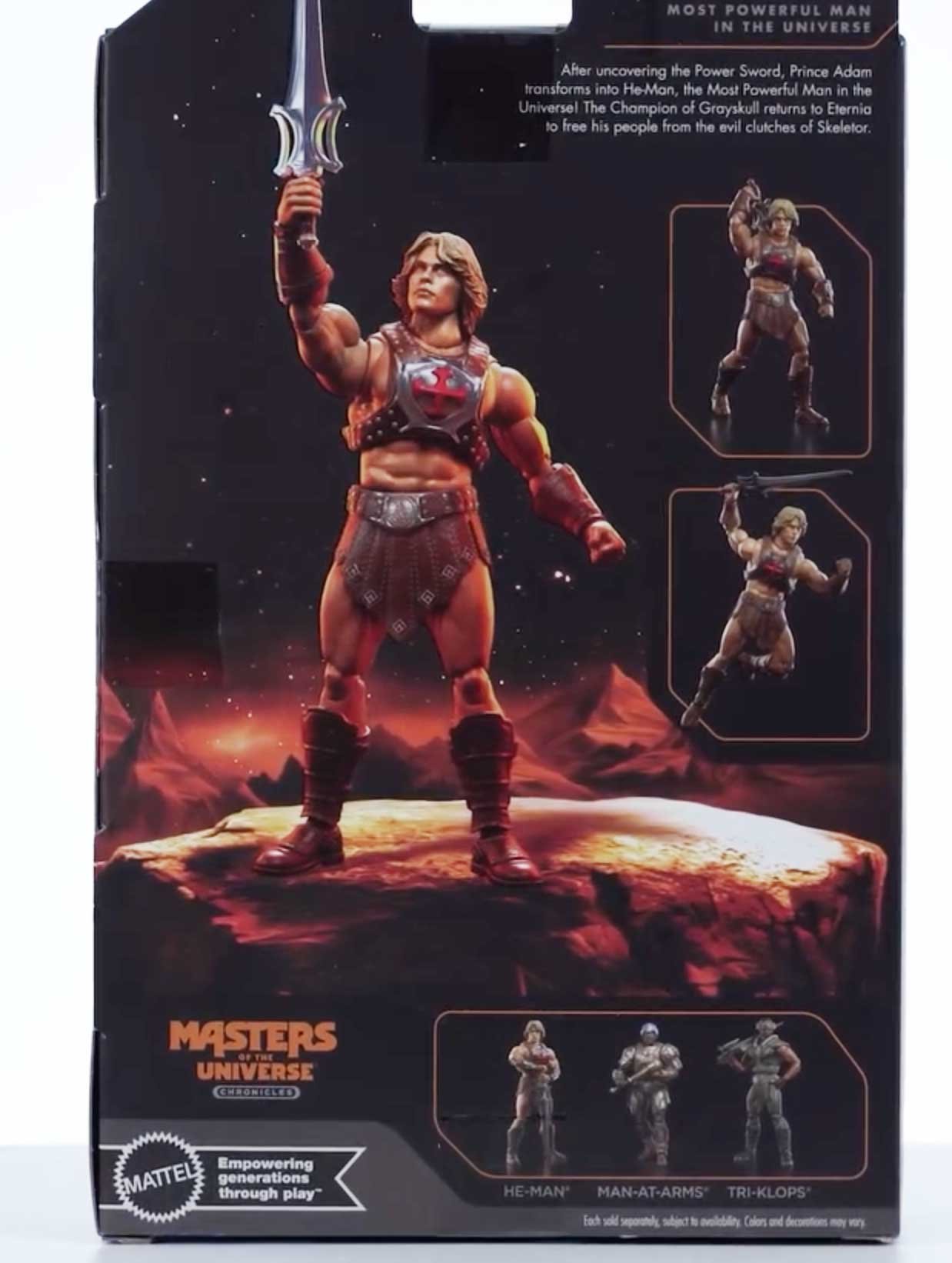
The back panel shows a full image of He Man holding the Power Sword, along with smaller inset photos demonstrating articulation and posing. A lineup image along the bottom shows He Man, Man At Arms, and Tri Klops as part of the series. It reads: “After uncovering the Power Sword, Prince Adam transforms into He Man, the Most Powerful Man in the Universe. The Champion of Grayskull returns to Eternia to free his people from the evil clutches of Skeletor.”
The opposite side panel displays Skeletor artwork with the skull face and purple hood set against a space themed background. The character art runs vertically along the panel next to the box window edge.
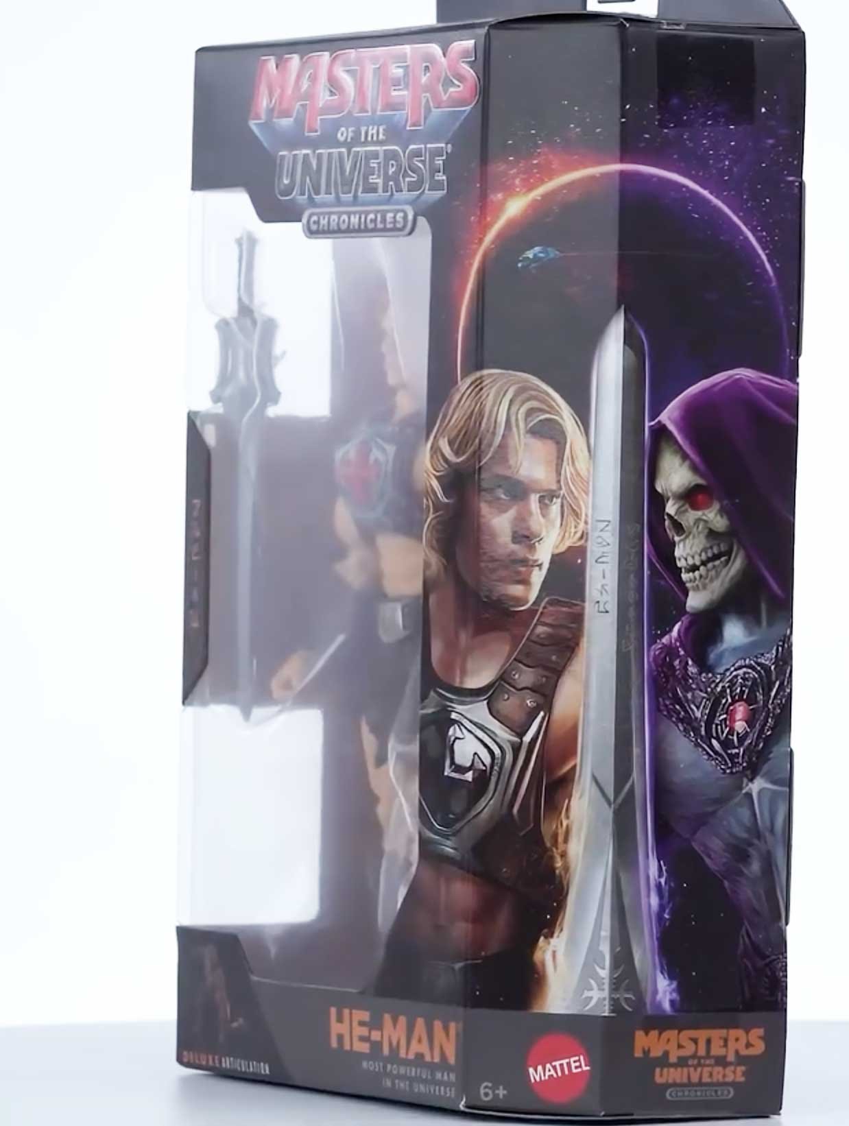
The side panel features a portrait of He Man with shoulder length blond hair and chest armor.
Man-At-Arms
The box uses a black window-style design with the Masters of the Universe Chronicles branding across the top, a large clear plastic window that fully exposes the figure, and character artwork printed along the right side panel. Inside, the figure is secured in a molded plastic tray, standing centered with accessories neatly slotted around it, including the staff, blaster, and alternate hands placed in their own recessed compartments. I like how the tray keeps everything visible and evenly spaced, with the figure framed cleanly from head to toe without anything overlapping or obscuring the view.
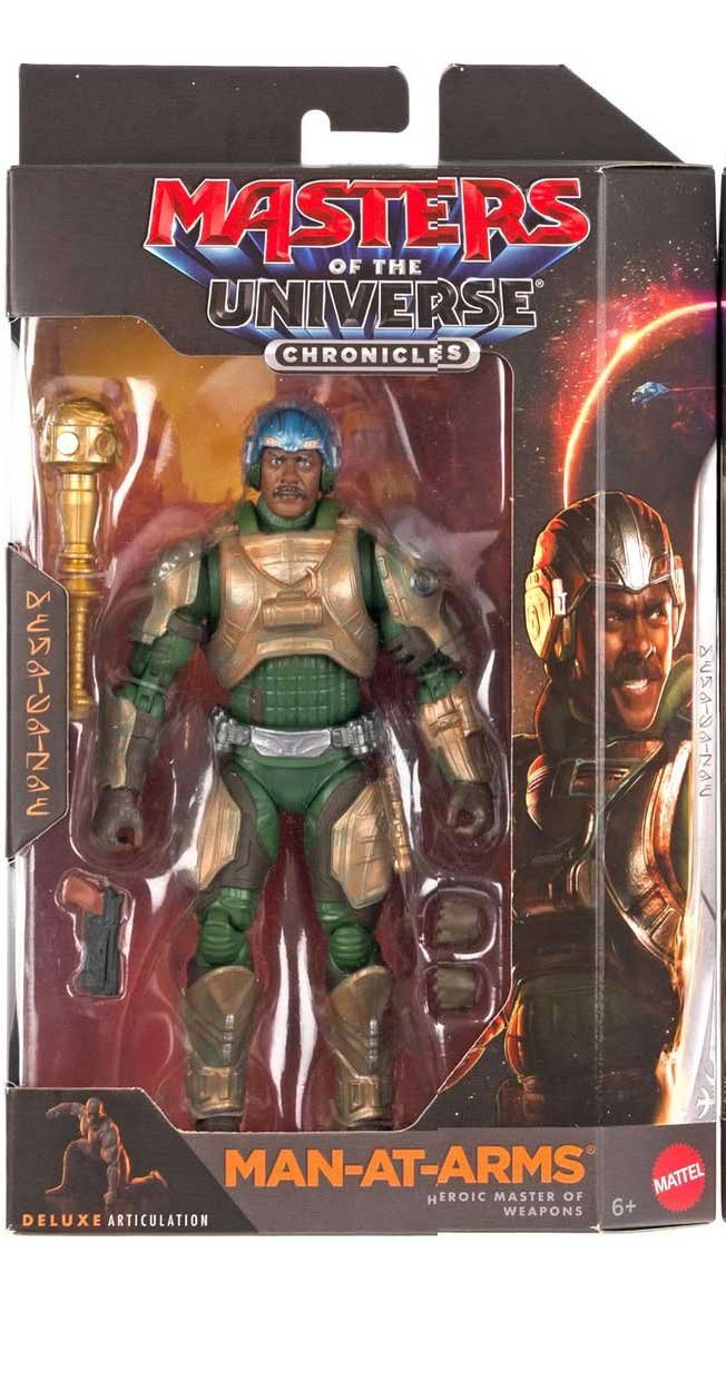
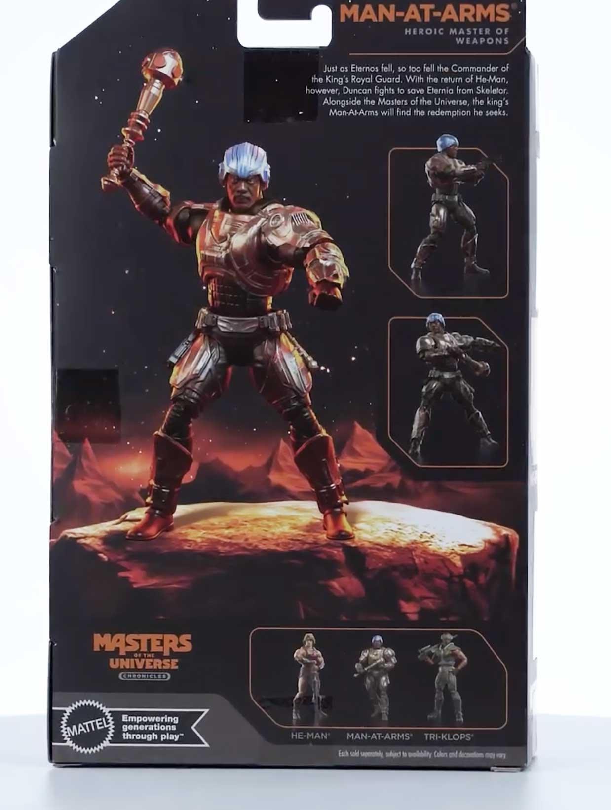
His bio reads: “Just as Eternos fell, so too fell the Commander of the King’s Royal Guard. With the return of He Man, however, Duncan fights to save Eternia from Skeletor. Alongside the Masters of the Universe, the king’s Man At Arms will find the redemption he seeks.” The back of the box features a large full-figure render placed front and center against a cosmic backdrop, as he’s shown standing on a rocky surface while holding his mace aloft, and I like how this gives the layout a strong focal point. To the right, smaller inset images show different posed views of the figure, while the bottom section includes a cross sell lineup highlighting He Man, Man At Arms, and Tri Klops, all framed cleanly within the overall design.
The side of the box continues the black windowed design with a tall vertical clear panel that lets you see the figure and inner tray from the side, and I like how it reinforces how much of the figure is visible without opening the package. A character portrait sits in a framed panel with the Man At Arms name and subtitle printed beneath it.
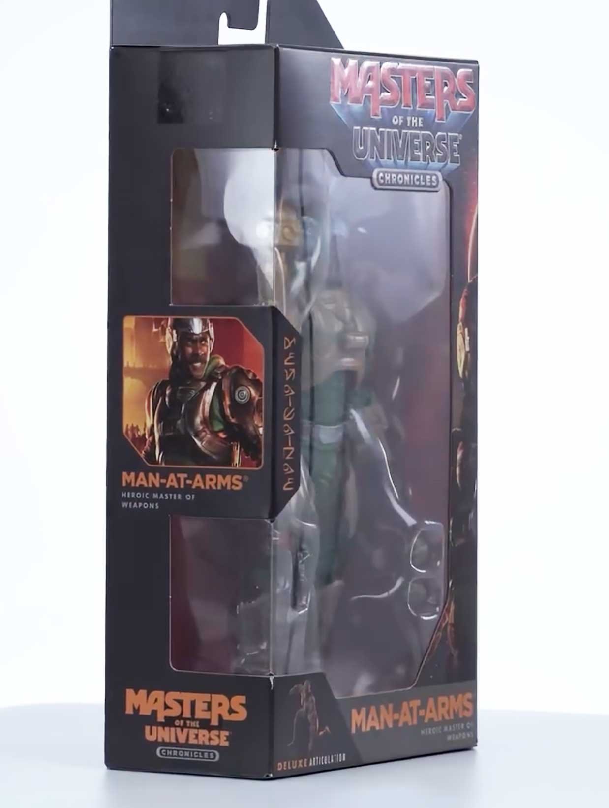
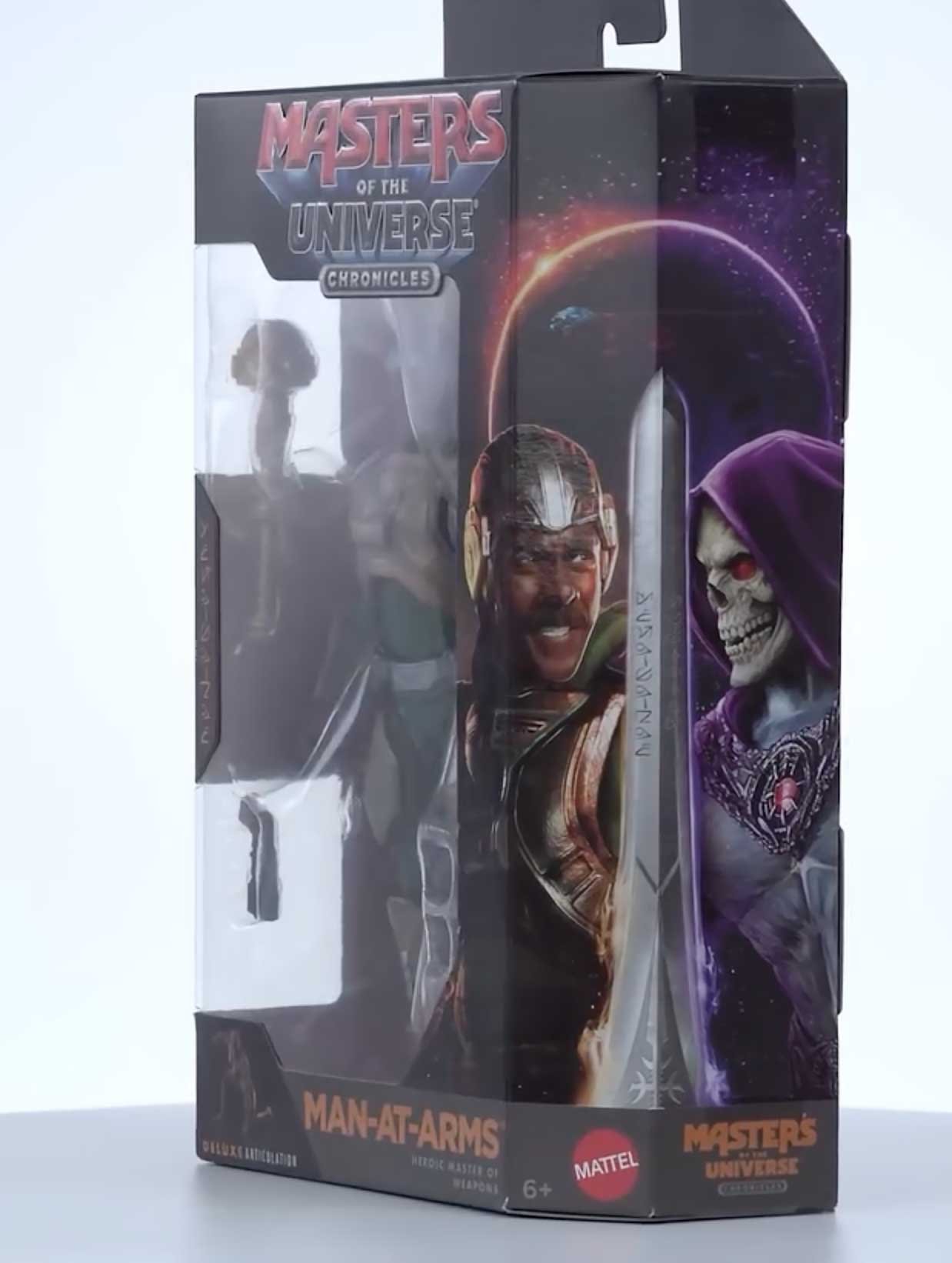
The illustrated panels wrap around the box with a dramatic, realistic rendering style that carries across the side and front edges, and I like how the artwork lines up cleanly when the panels meet. One side features a close-up portrait of Man At Arms in his helmet and armor, while the adjacent panel shows Skeletor in profile, creating a face-to-face visual contrast that runs vertically along the packaging. The cosmic backdrop with planets and stars ties the illustrations together, giving the box a continuous scene that feels intentional rather than segmented.
Tri-Klops
The window box uses a tall, clean cutout that frames the figure head to toe, and I like how the purple interior backing gives the contents more depth without crowding the view. Inside, the molded tray holds the figure squarely in the center while the long weapon is secured vertically along the side, keeping everything easy to see and evenly spaced. Side panel artwork and color blocking wrap into the front edge, giving the package a cohesive look while still prioritizing visibility of what is inside.
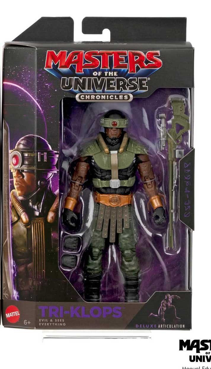
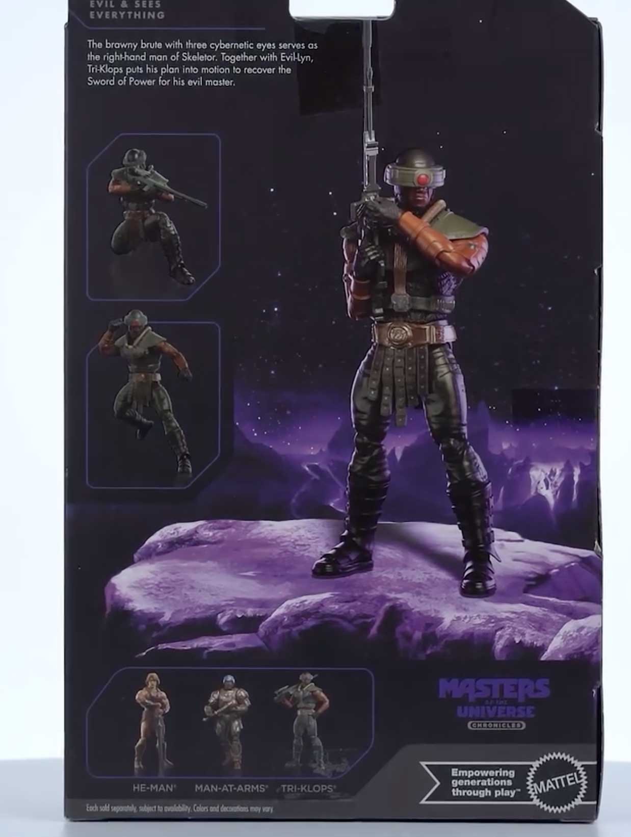
His bio reads: “The brawny brute with three cybernetic eyes serves as the right hand man of Skeletor. Together with Evil Lyn, Tri Klops puts his plan into motion to recover the Sword of Power for his evil master.” The back of the box features a full-height character render centered against a dark cosmic scene with the figure posed on a rocky surface, which I like as it mirrors the dramatic tone used across the line. Along the left side, smaller inset images show alternate poses framed in simple borders, giving a quick look at articulation without cluttering the layout. The bottom section includes a horizontal cross sell lineup of He Man, Man At Arms, and Tri Klops, while the Masters of the Universe Chronicles branding and Mattel messaging are tucked neatly into the lower corners to keep the focus on the main artwork.
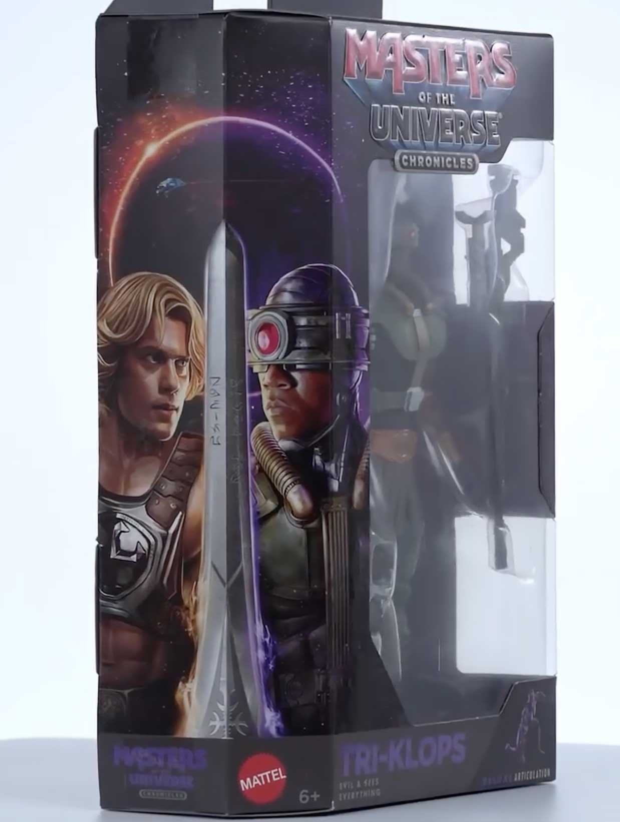
On this side of the box, the Evil Warriors packaging is clearly mirrored, and I like how the layout flips the visual balance compared to the hero releases. The illustrated portraits run vertically with Tri Klops facing inward, paired against He Man on the adjacent panel, creating a face off effect when the boxes are lined up on a shelf. The cosmic background and blade motif stay consistent, but the reversed orientation makes it easy to distinguish the Evil Warriors at a glance while keeping the overall Chronicles design language intact.
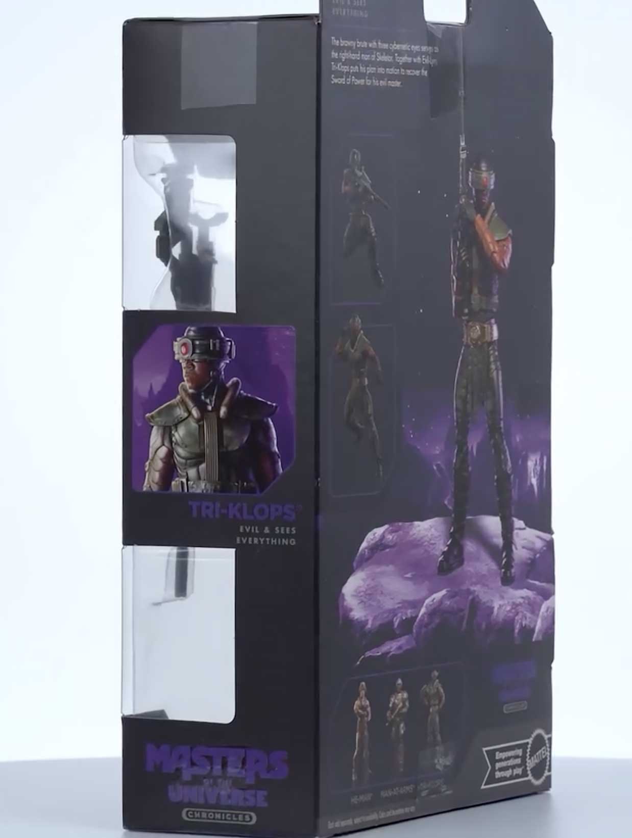
A framed portrait of Tri Klops sits mid-panel with his name and subtitle beneath it, while the purple cosmic color palette carries through from the back panel and ties the design together. From this angle, you can also see how the inner tray keeps the figure and weapon aligned straight inside the box, with nothing shifting or overlapping during display.
Complete Your MOTU Collection
Be sure to check out our Masters of the Universe shop pages where we’ve curated figures from MOTU Origins, Masterverse, Classics, Vintage and more so you can find the figures you need easier!