WWE Superstars Series 17 In-Hand Images
Affiliate links in post. See Disclosure Policy.
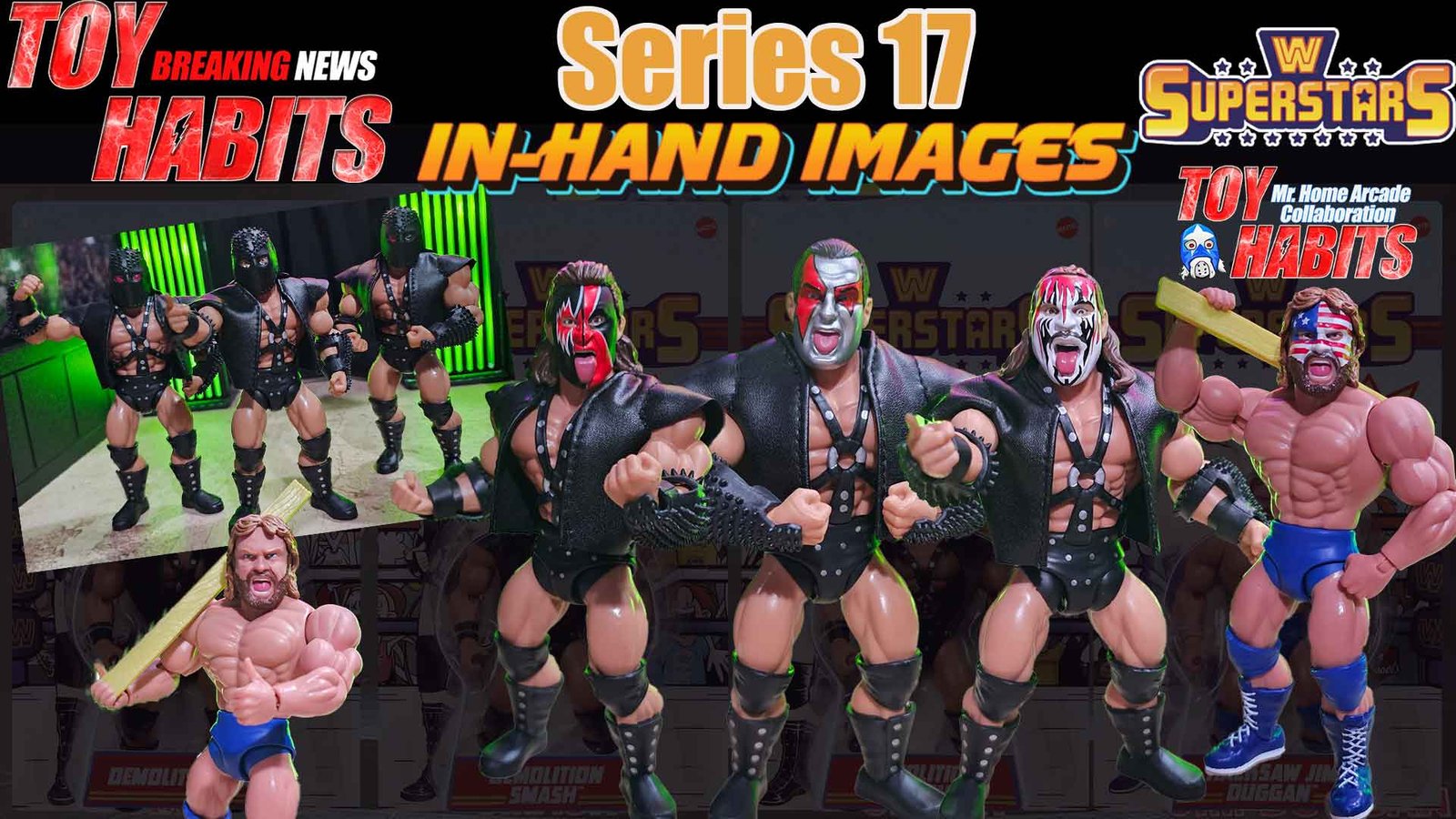
I swear the Demolition theme starts looping in my head the second I lay eyes on WWE Superstars Series 17, and honestly, I am not mad about it one bit, because this wave feels like a love letter to everything I adored about WWF tag team wrestling back in the day. Before diving into the figures themselves, I have to send a massive shout out to Mr. Home Arcade for coming through for the toy community yet again and going above and beyond by snagging these early and sharing them with the rest of us, because anyone who has tried hunting these down at retail already knows just how near impossible they have been to find in the wild. Series 17 is anchored by my all time favorite tag team, Demolition, a duo that defined dominance, attitude, and presence in that late 80s era, and pairing them with Hacksaw Jim Duggan feels incredibly intentional and well thought out. Duggan’s inclusion, complete with gear painted with the American flag, directly calls back to his SummerSlam 1989 appearance when he teamed with Demolition, and that kind of historical nod is exactly what makes this line so much fun to collect. Across the entire WWE Superstars lineup so far, this wave stands out to me as the most purposeful and cohesive selection of characters, where every figure feels like it belongs and contributes to a specific moment in wrestling history rather than just filling a slot. Between the nostalgia, the character choices, and the clear respect for the source material, Series 17 hits all the right notes for longtime fans like me, so let’s dive in and start breaking down the figure details.
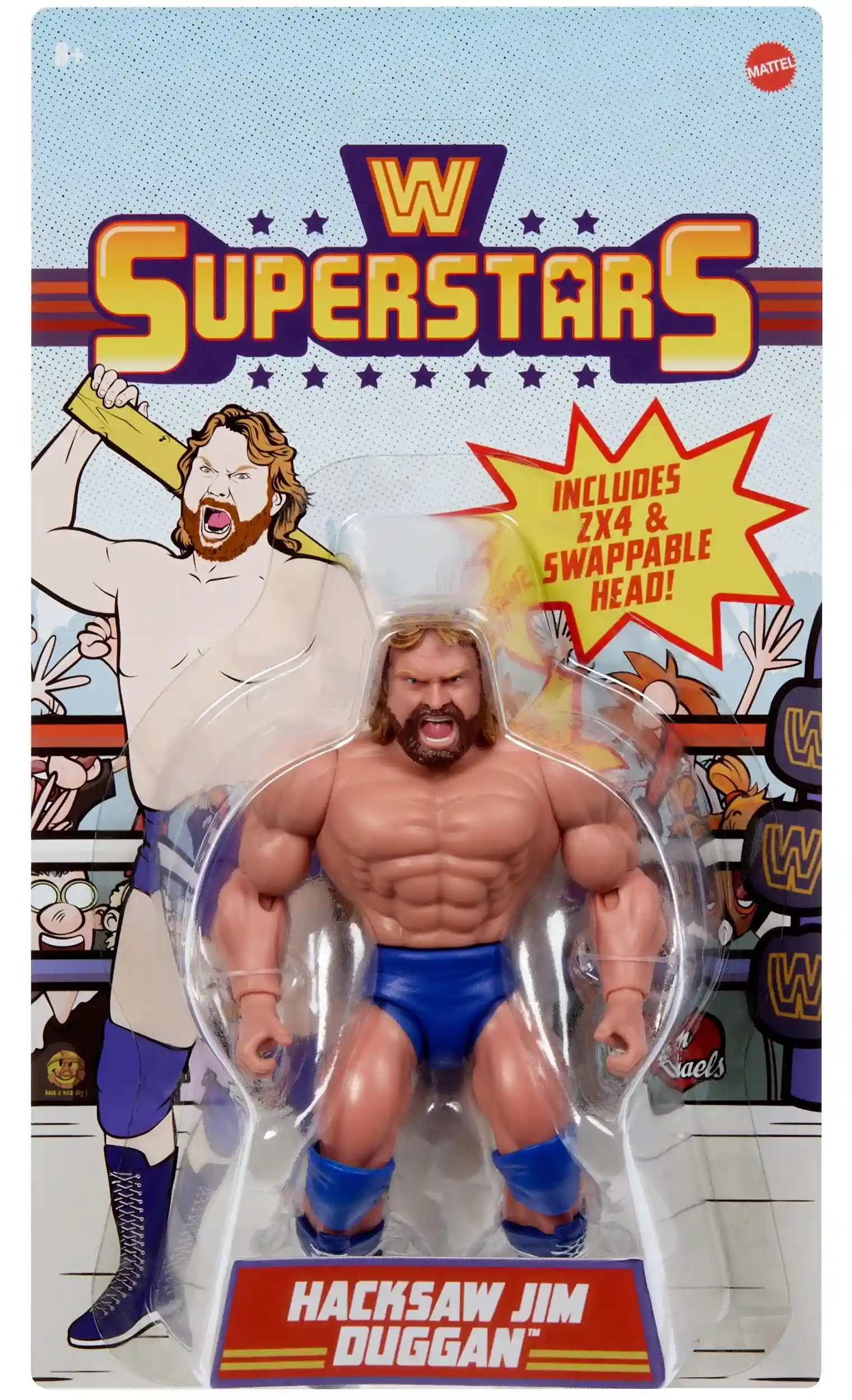
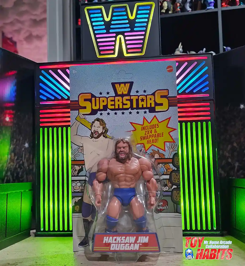
Hacksaw Jim Duggan
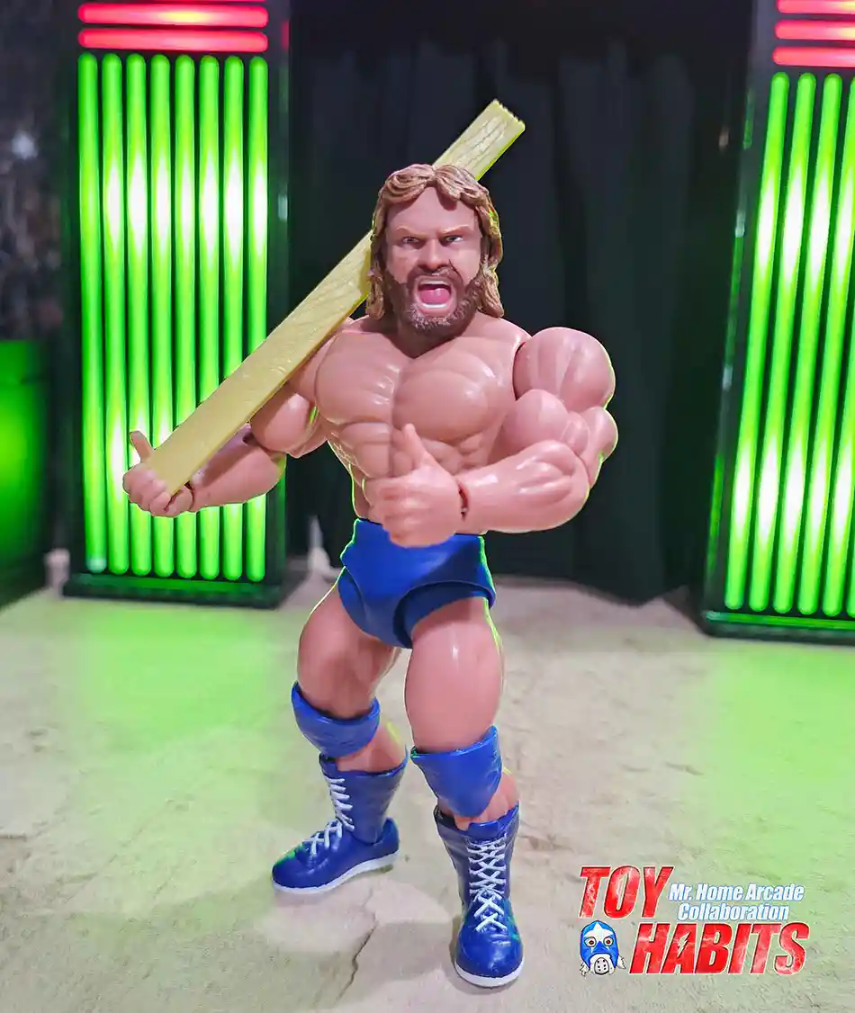
I’m loving how the figure jumps out here with that expressive head sculpt, showing off the big open-mouth yell that feels so true to the character, and the wavy hair and full beard add a lot of personality up close. The bright blue trunks, matching knee pads, and tall laced boots keep the classic color combo tight, and I can see the crisp sculpt lines across the torso that really bring out the detail. The illustrated backdrop highlights the swinging 2×4 and the alternate head callout, making this Hacksaw Jim Duggan release feel packed with fun touches right on the card.
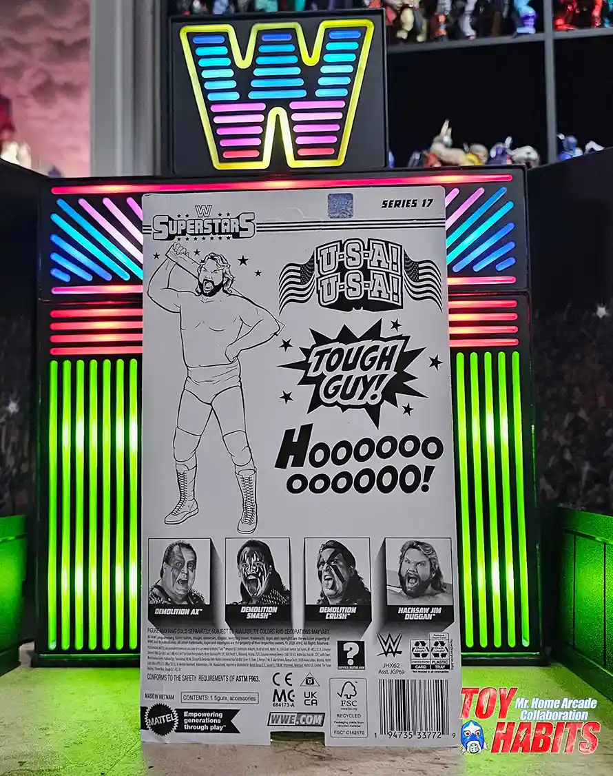
The card back is built around bold black-and-white illustrated artwork of Hacksaw Jim Duggan posed with the 2×4 raised overhead, rendered with clean line work that feels straight out of a vintage program. The phrases are loud and unapologetic, with “U-S-A! U-S-A!”, “Tough Guy!”, and the stretched-out “Hoooooo!” stacked across the layout in oversized, comic-style lettering. I love how the mix of stars, flags, and punchy text turns the entire back into a chant you can practically hear just by looking at it.The card back is built around bold black-and-white illustrated artwork of Hacksaw Jim Duggan posed with the 2×4 raised overhead, rendered with clean line work that feels straight out of a vintage program. The phrases are loud and unapologetic, with “U-S-A! U-S-A!”, “Tough Guy!”, and the stretched-out “Hoooooo!” stacked across the layout in oversized, comic-style lettering. I love how the mix of stars, flags, and punchy text turns the entire back into a chant you can practically hear just by looking at it.
Hacksaw Jim Duggan is shown with the 2×4 resting on his shoulder, long brown hair and beard framing the open-mouthed yell that defines his classic look. He’s wearing the blue trunks with matching knee pads and lace-up boots, keeping the presentation clean and instantly recognizable. I really like how Mr. Home Arcade set this pose up, because it feels like that familiar entrance moment where he’s soaking in the crowd reaction.
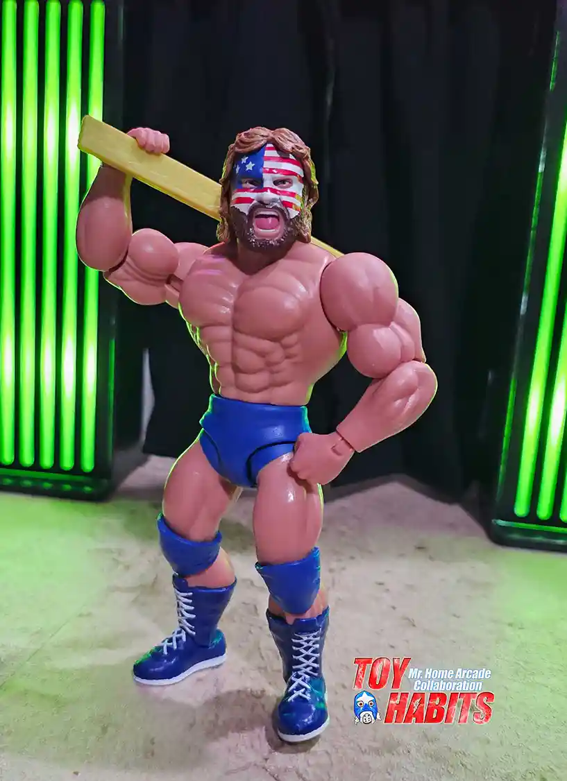
This image highlights the look Duggan wore when he teamed up with Demolition at SummerSlam 1989. The red, white, and blue paint covers the face in bold stripes, paired with the same blue ring gear and boots to keep the look consistent. Seeing this version immediately takes me back to that specific moment, and it’s great to have that era represented right alongside his more traditional appearance.
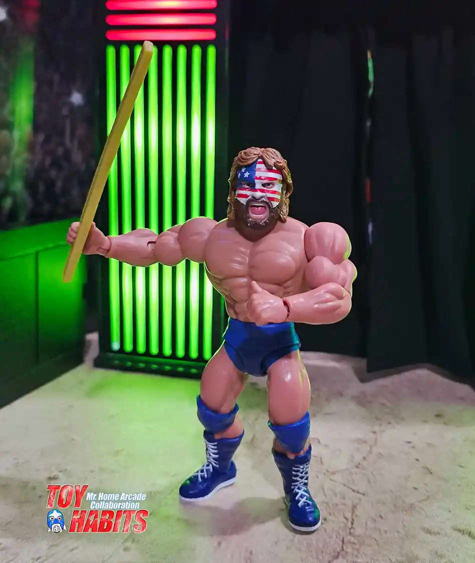
The shot with the 2×4 stretched outward puts all the attention on the accessory itself, with the plank extending past his reach and becoming the focal point of the pose. The length and straight sculpt of the 2×4 read clearly, and the way it’s held makes it feel like it’s being presented as much as wielded.
Demolition
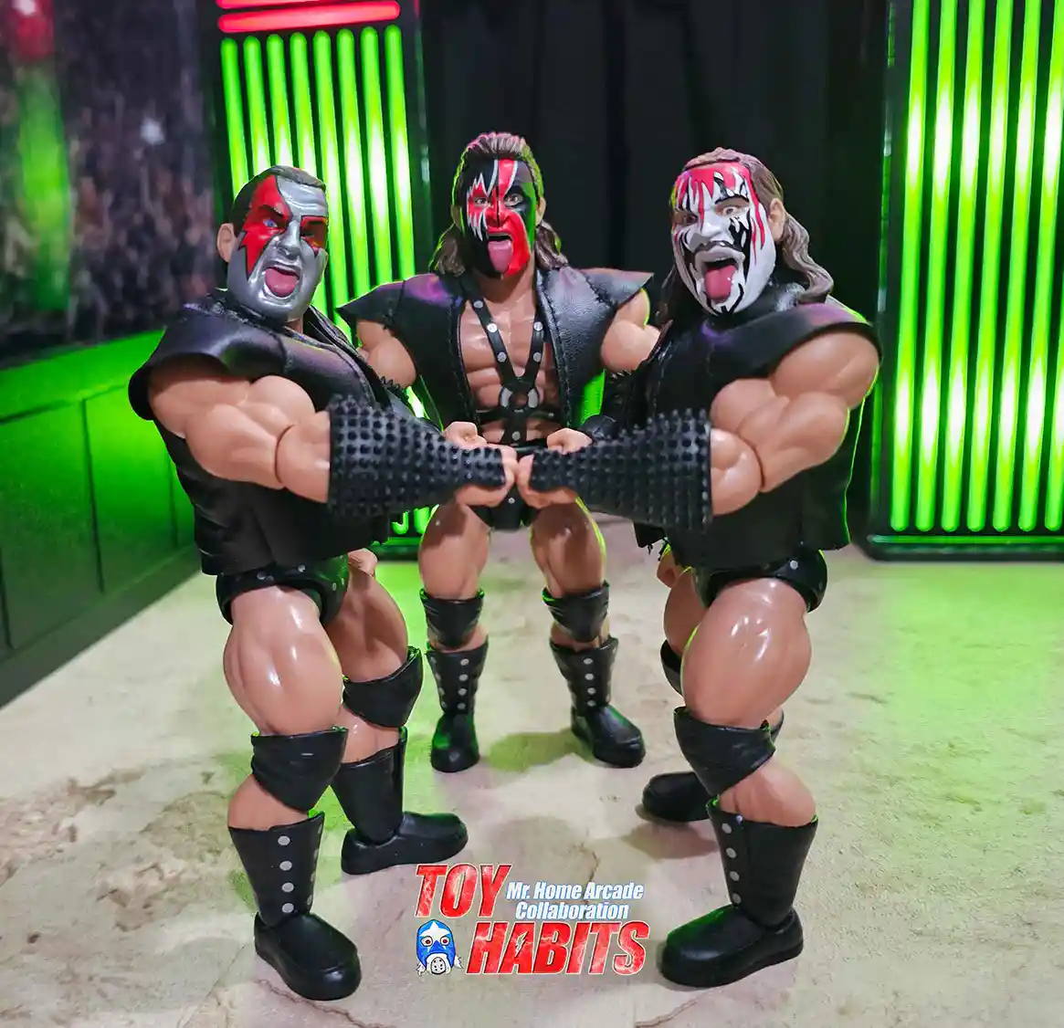
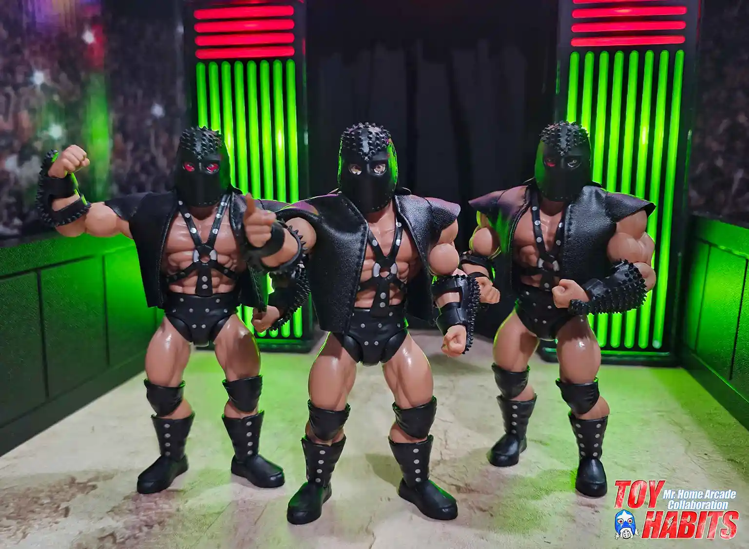
Three figures lock fists in the center, recreating Demolition’s signature stance with Ax and Smash flanking Crush. I am immediately drawn to the bold face paint, with Ax’s metallic silver and red pattern, Smash’s red, black, and white design with the extended tongue expression, and Crush’s white base accented by red and black streaks that flow across the face. The matching black ring gear ties them together, from the sleeveless tops to the textured wrist guards, knee pads, and tall boots, while the sculpted poses keep their arms pulled inward as if they are powering up for impact. The trio reads as a unified team , hands clenched together and bodies angled forward, capturing that unmistakable Demolition presence I grew up loving.
The figures are shown masked, each wearing the studded black helmet with eye cutouts and the same spiked texture running across the top, which completely changes the look from the face paint versions. I really like how you can still tell who is who thanks to the telltale face paint details visible around the eyes beneath the masks, a smart touch that keeps each identity clear. The black chest harness with silver studs sits over the torso and pairs with the sleeveless soft goods vests, spiked wrist guards, studded trunks, and matching boots, keeping the trio visually unified as they step forward together with clenched hands. The one thing I personally wish they added was a studded pattern on the soft goods vests, since that extra texture would better recreate their classic entrance look.
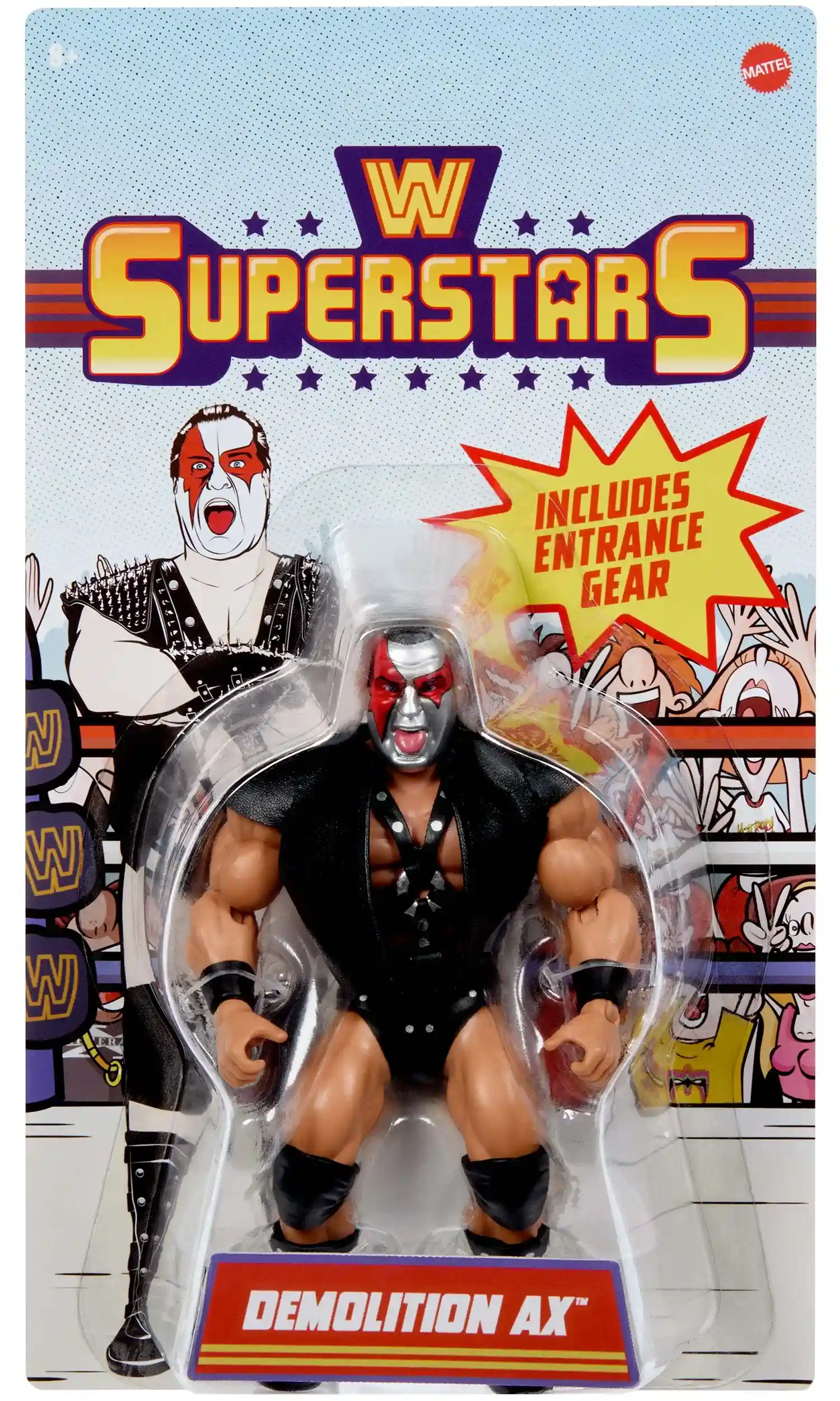
Ax
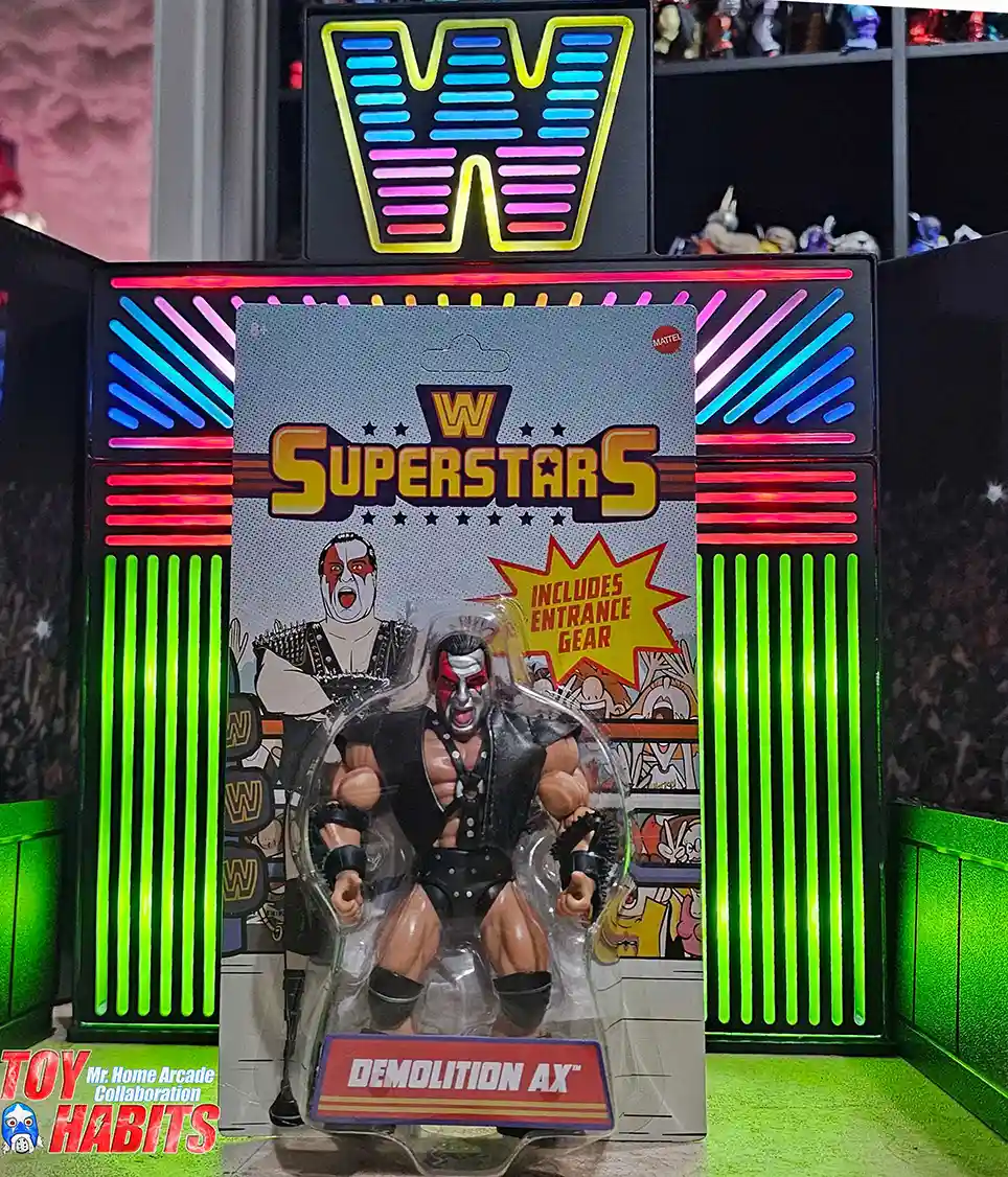
The card front leans fully into the retro WWE Superstars style, with bold illustrated artwork filling the backing card and a high-energy, comic-inspired look that immediately pulls your eye in. I really like how the illustration is layered behind the bubble, giving the presentation depth while keeping everything clean and readable. The figure is packed upright in a standard blister bubble, centered on the card with the entrance gear visible alongside inside the bubble, making the whole setup feel very much like a classic peg-ready presentation from the line.
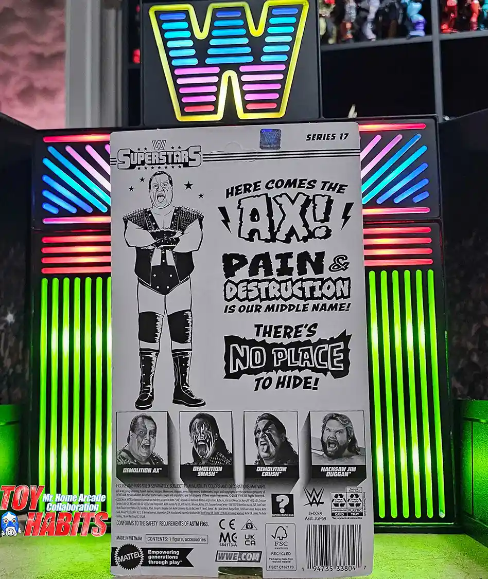
The card back features bold black-and-white illustrated art of Ax with his arms crossed, rendered in a rough, high-contrast style that matches the attitude of the team. I immediately latch onto the stacked phrases blasting across the layout, reading “Here Comes the Ax!”, “Pain & Destruction Is Our Middle Name!”, and “There’s No Place to Hide!”, all done in jagged lettering that feels loud and aggressive. The mix of character art and oversized text sells that classic Demolition bravado, and I can almost hear the promo echoing off the card as I’m reading it.
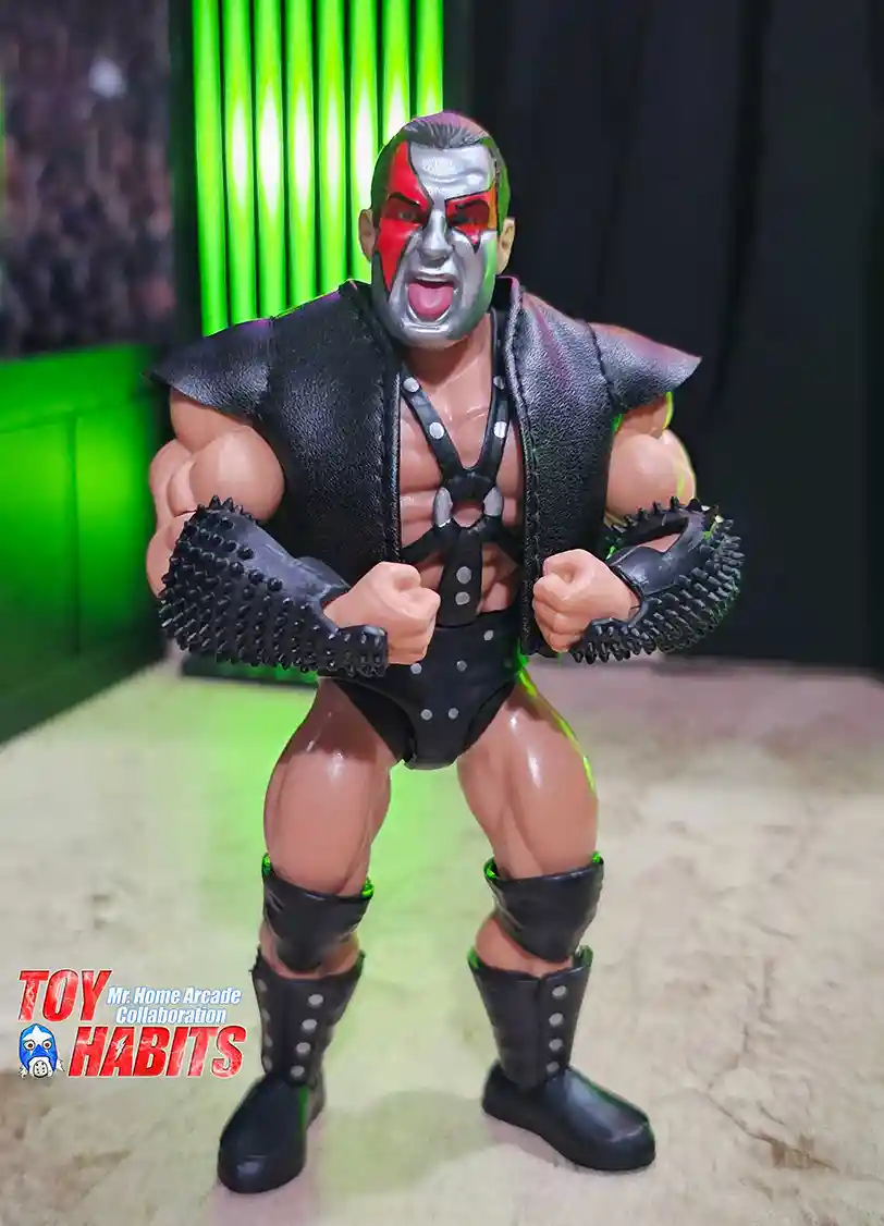
The figure shows Ax with the red and silver face paint split cleanly down the face, mouth open in a yell, and short dark hair sculpted tight to the head. He is wearing the black soft goods entrance vest over the studded chest harness, with spiked wrist guards, rivet-detailed trunks, knee pads, and tall boots all working together for that unmistakable Demolition look. I really like how Mr. Home Arcade posed him with the fists pulled in tight, it feels like he is right at that moment before the bell rings.
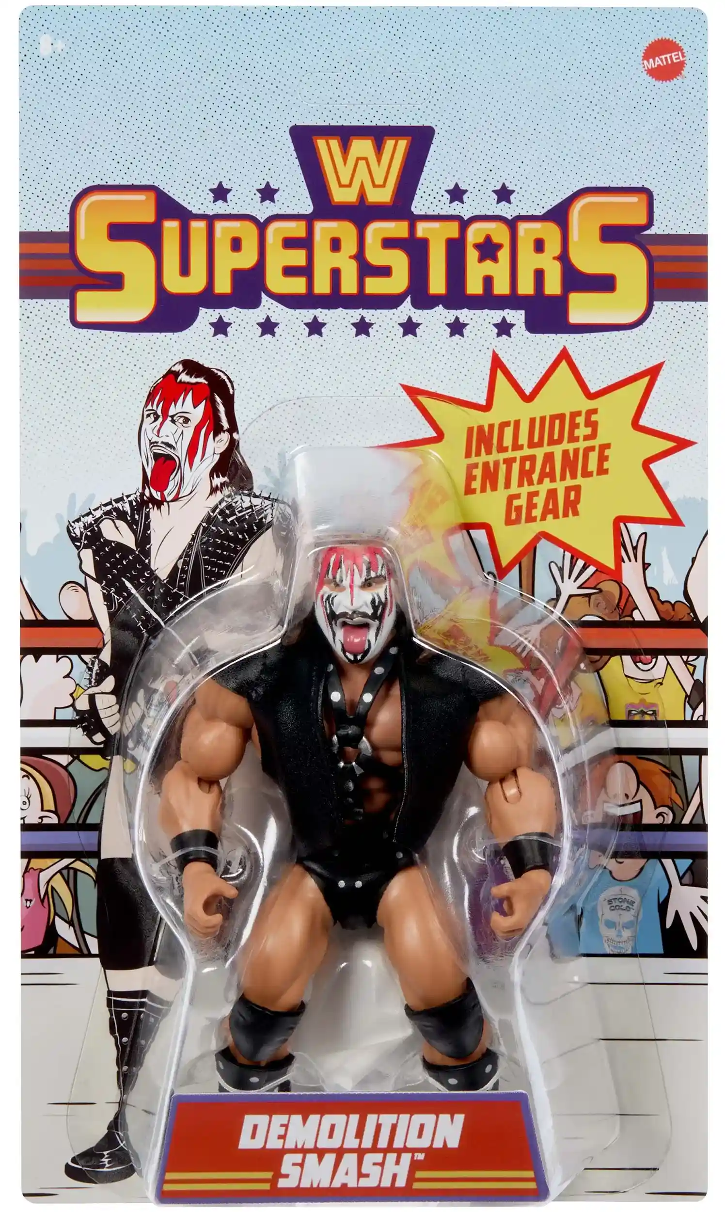
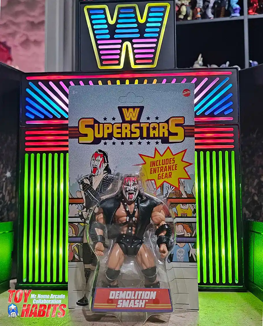
Smash
The card front is driven by bold illustrated character art that fills the backing card, with the artwork framed to sit behind the blister and remain visible along the edges, giving the presentation a layered, comic-style feel. The illustration carries a lot of energy through expressive line work and strong contrast, helping the card feel visually active even before you notice the figure. Everything is packed upright in a clear blister bubble centered on the card, creating a straightforward, peg-ready layout that keeps the focus on the artwork and overall presentation.
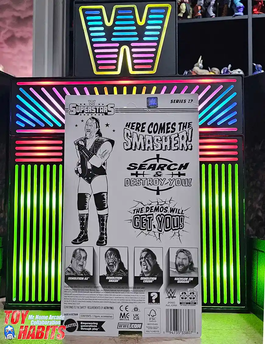
The card back is laid out with stark black-and-white illustrated artwork of Smash standing front and center, rendered with thick lines and heavy contrast that fits the Demolition aesthetic perfectly. Surrounding the art are bold, jagged phrases that jump off the card, including “Here Comes the Smasher!”, “Search & Destroy You!”, and “The Demos Will Get You!”, all styled to feel loud and confrontational. I like how the cracked text effects and graphic targets reinforce that chaotic, no-escape tone, making the entire back read like a warning poster rather than standard packaging copy.
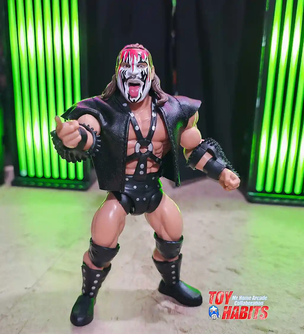
The figure shows Smash with the white, red, and black face paint framed by long brown hair, mouth open with the tongue extended, and a stern forward-facing expression. He is wearing the black soft goods entrance vest over the studded chest harness, with spiked wrist guards, rivet-detailed trunks, knee pads, and tall boots completing the gear. I’m really digging how Mr. Home Arcade staged this one, with the forward-pointing hand and staggered stance giving the pose a lot of attitude.
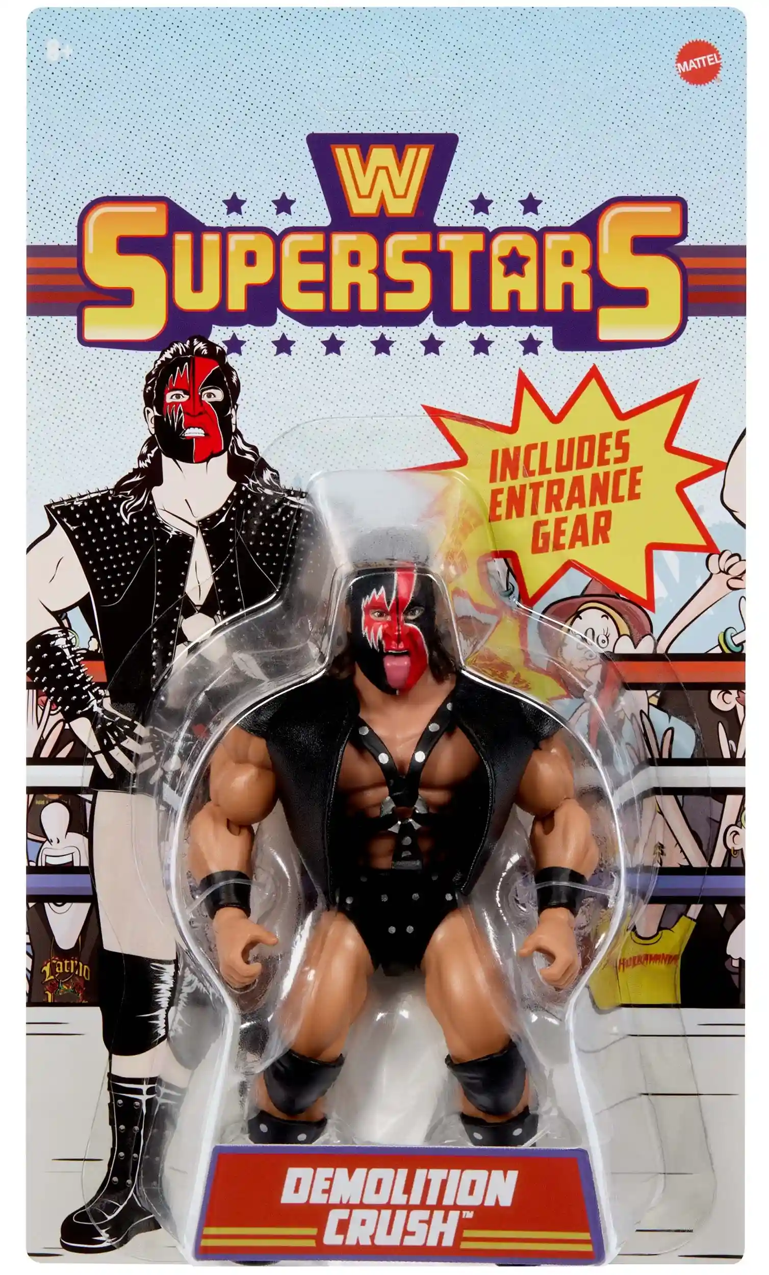
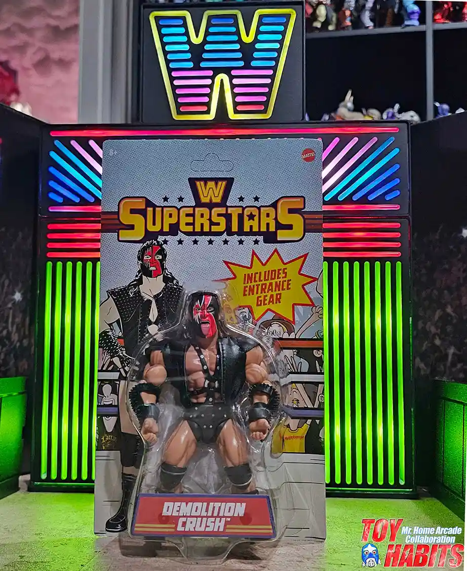
Crush
The card front features bold illustrated artwork set against the classic WWE Superstars card design, with the logo prominently placed at the top and stylized character art filling the background behind the bubble. I like how the illustration peeks out around the edges of the blister, giving the card a layered, comic-inspired look that feels straight out of the late ’80s. The figure is packed upright in a clear blister bubble centered on the card, creating a clean, straightforward presentation that lets the artwork and overall packaging design do the heavy lifting.
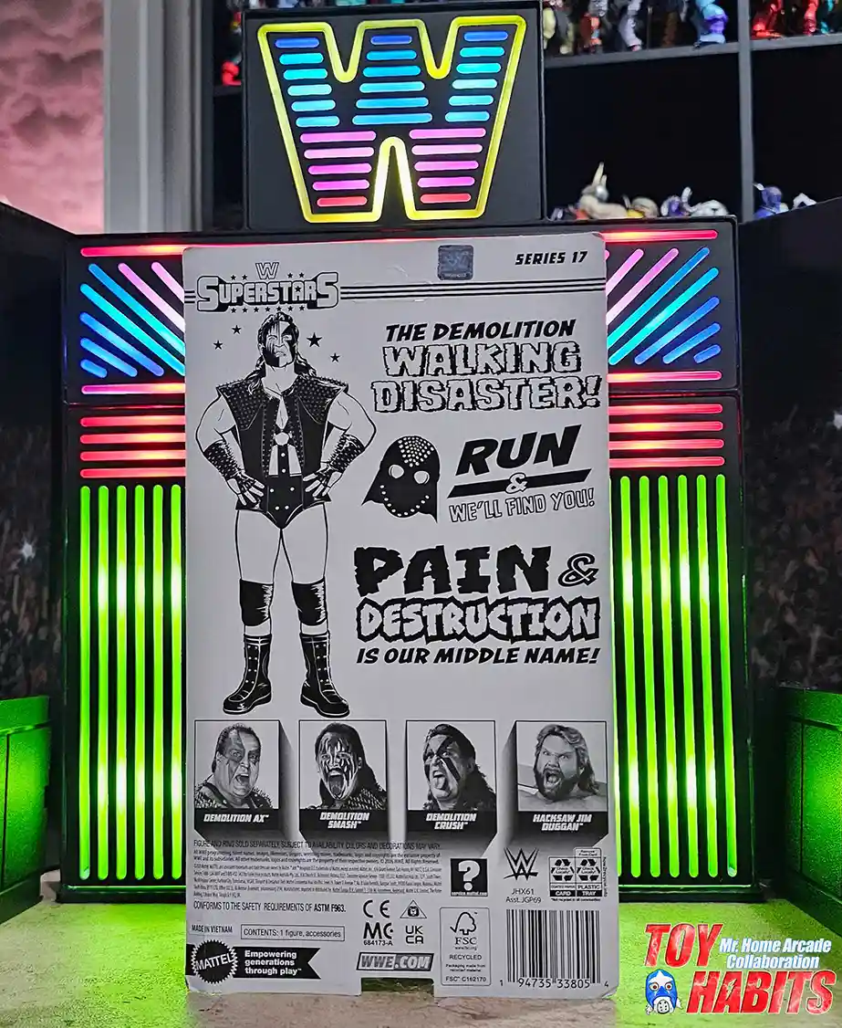
The card back is packed with bold black-and-white artwork and loud, stacked phrases that lean hard into Demolition’s intimidating tone. A full illustrated figure anchors the layout, surrounded by punchy callouts reading “The Demolition Walking Disaster!”, “Run… We’ll Find You!”, and “Pain & Destruction Is Our Middle Name!”, with jagged lettering and graphic icons that feel ripped straight from an old-school promo wall. I love how the layout balances the character art with oversized text, making the whole back of the card feel aggressive, chaotic, and very on-brand for the team.
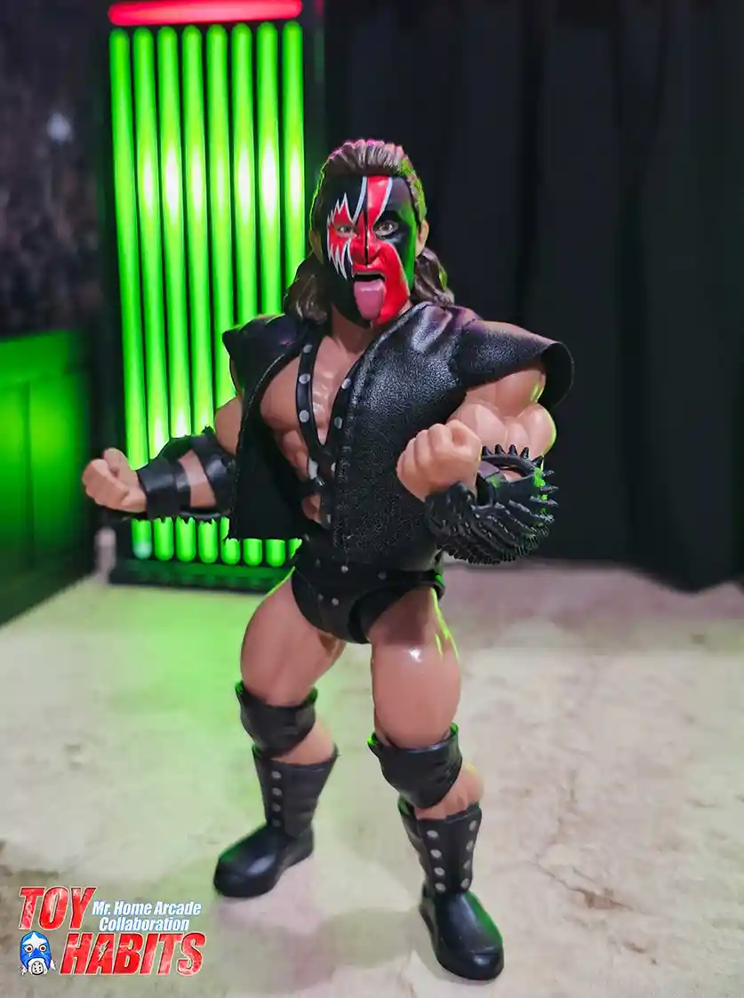
The figure shows Crush with the bold red and black face paint split across the face, tongue extended, and long brown hair flowing back from the sculpted head. He is wearing the black soft goods entrance vest over the studded chest harness, with spiked wrist guards, rivet-detailed trunks, knee pads, and tall boots all matching the classic Demolition look. I really like how Mr. Home Arcade posed him with the arms flexed outward, it captures that aggressive stance without overdoing it.
Walmart Listings